Trek Checkmate & Checkpoint
Concept, design, and art direction for the launch campaign of Trek’s newest gravel bikes.
Photography: Daghan Perker (Checkmate), Dylan Remis (Checkpoint) / Video: Ben Page / Copy: Emily Thome / Product Manager: Whitney Beadle
Two Bikes. Two Customers.
One Gravel Family.
As gravel explodes in popularity, Trek is looking to cement themselves as an authentic authority in the discipline. With this dual-launch, Trek introduces an all-new race focused bike in Checkmate, and an improved adventure bike in Checkpoint.
Leading the visual efforts, I aimed to establish an aesthetic for gravel bikes that would connect these two models, as well as any future gravel bikes.
Checkmate Editorial Page
Attempting to create the best customer experience, I shared formats and motifs across the two pages. Customers comparing the two bikes would find familiarity in the pages. In addition, the shared DNA establishes an aesthetic for Trek’s gravel bikes that can be carried forward.
Checkpoint Editorial Page
Email Campaign
Checkmate Accessories Email
Follow-up email to gravel customers, educating consumers on how to equip their gravel race bike, including Trek’s new Adventure Bags.
(P.S. this was a long email, content has been abbreviated for display purposes.)
Project One ICON Raw Lithos Launch
Coinciding with the launch of the Checkmate, Trek introduced a new custom paint scheme available in Project One. The visual language is consistent with the rest of the gravel family, but simplifies the frame motif to be more premium and subdued.
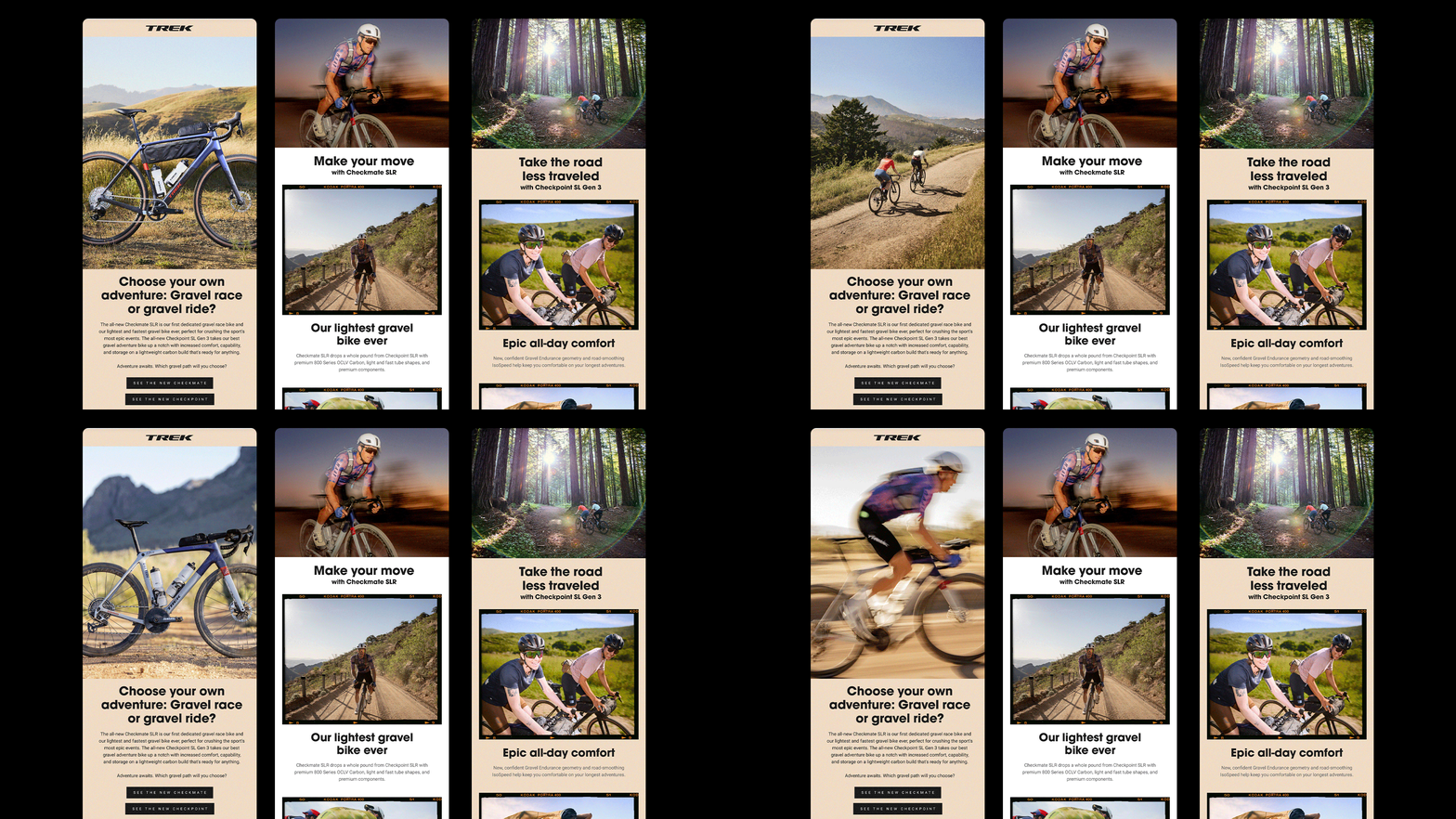
Combined Launch Email
Consumer email to launch both bikes and educated customers.
(P.S. this was a very long email, content has been abbreviated for display purposes.)
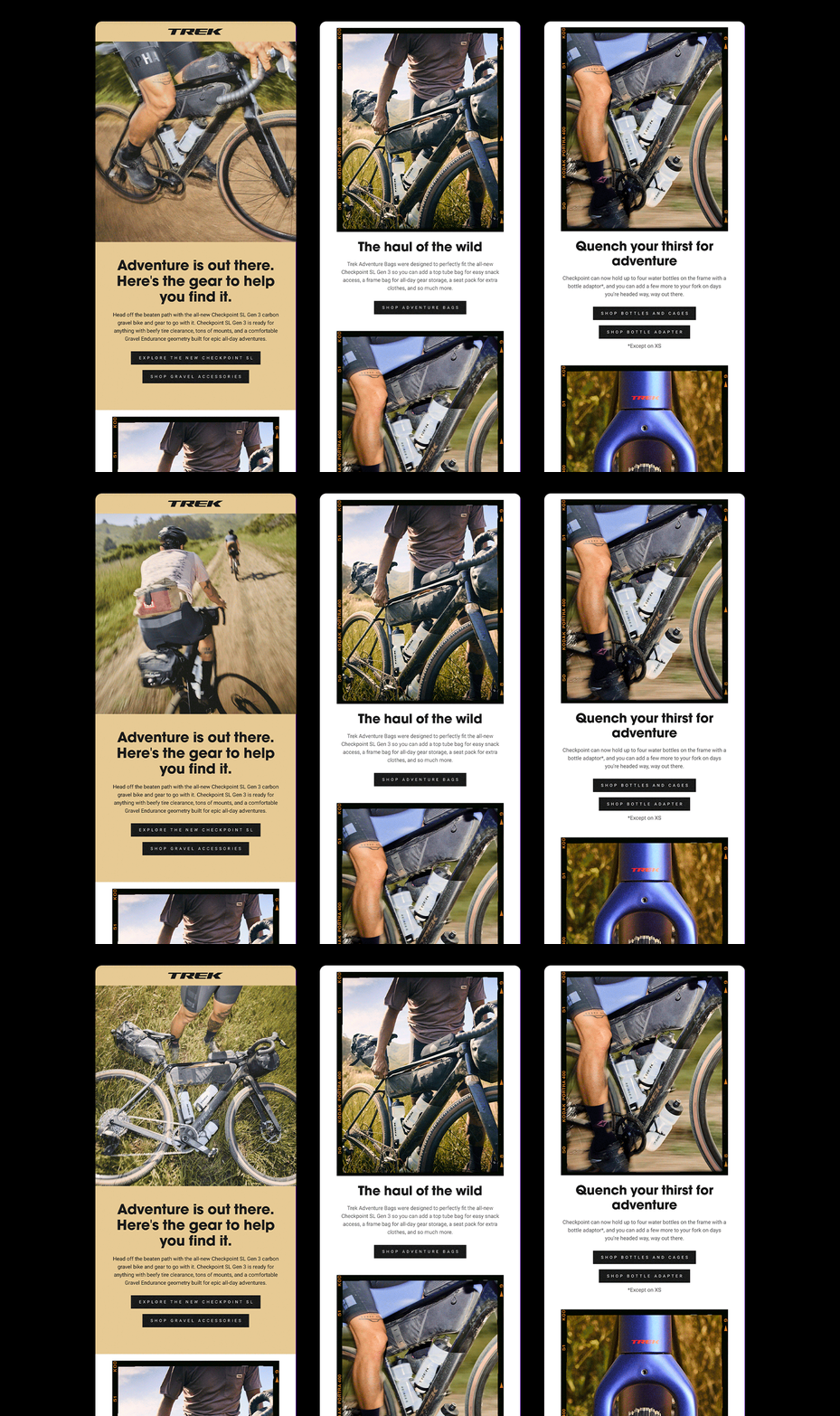
Checkpoint Accessories Email
Follow-up email to gravel customers, educating consumers on how to equip their adventure gravel bike, including Trek’s new Adventure Bags.
(P.S. this was a long email, content has been abbreviated for display purposes.)
Retail Signage
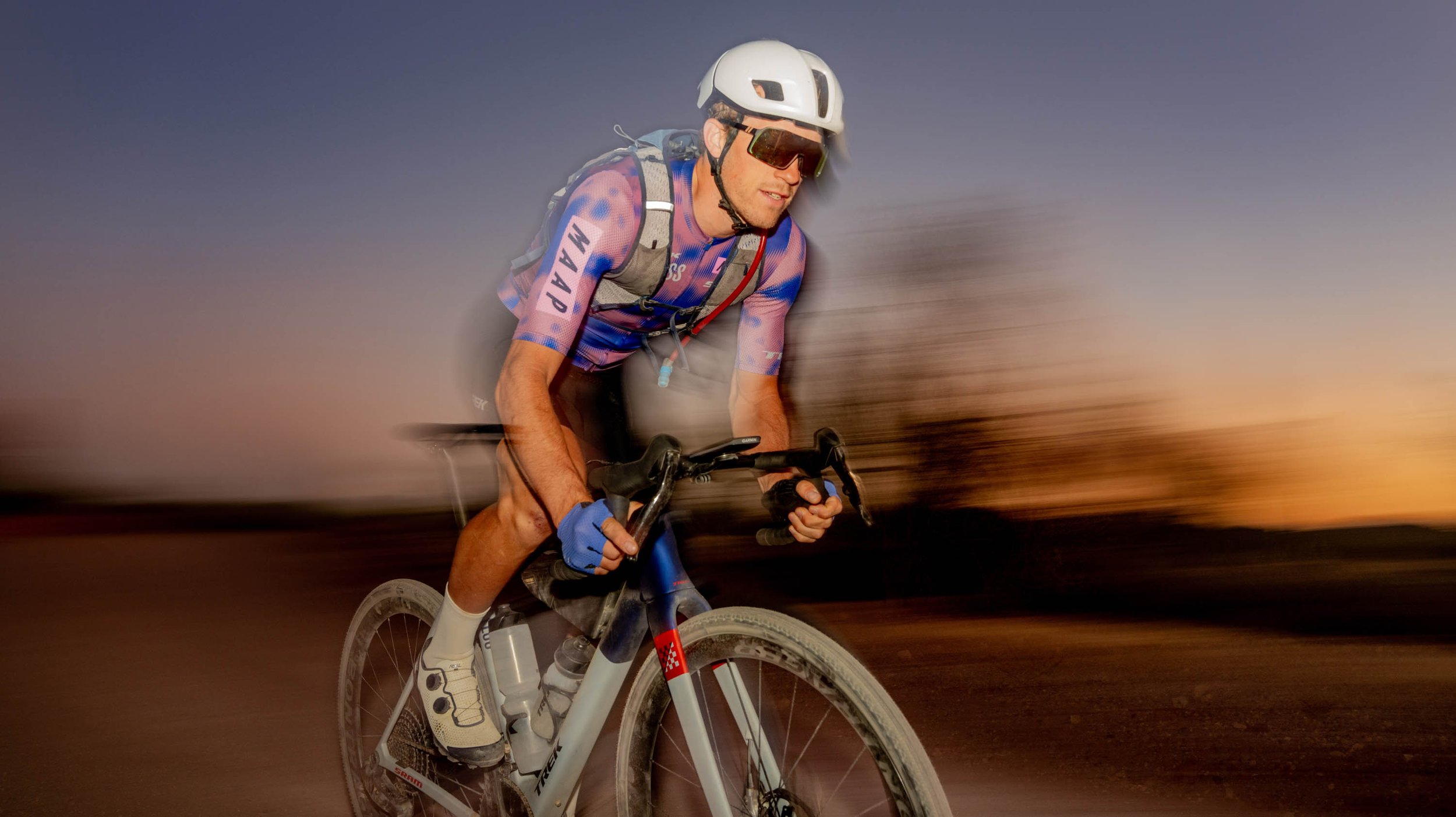
Photo Selects




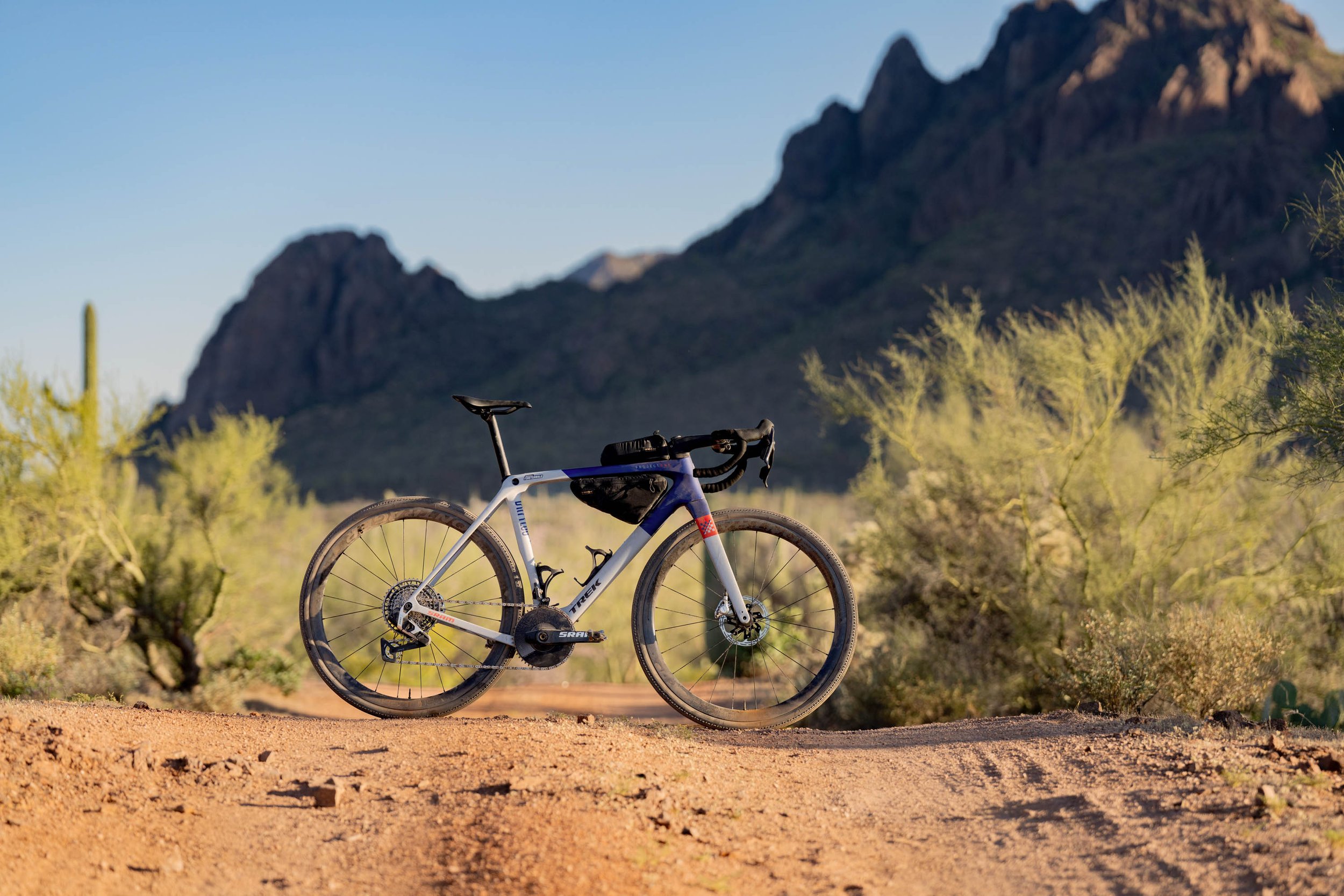
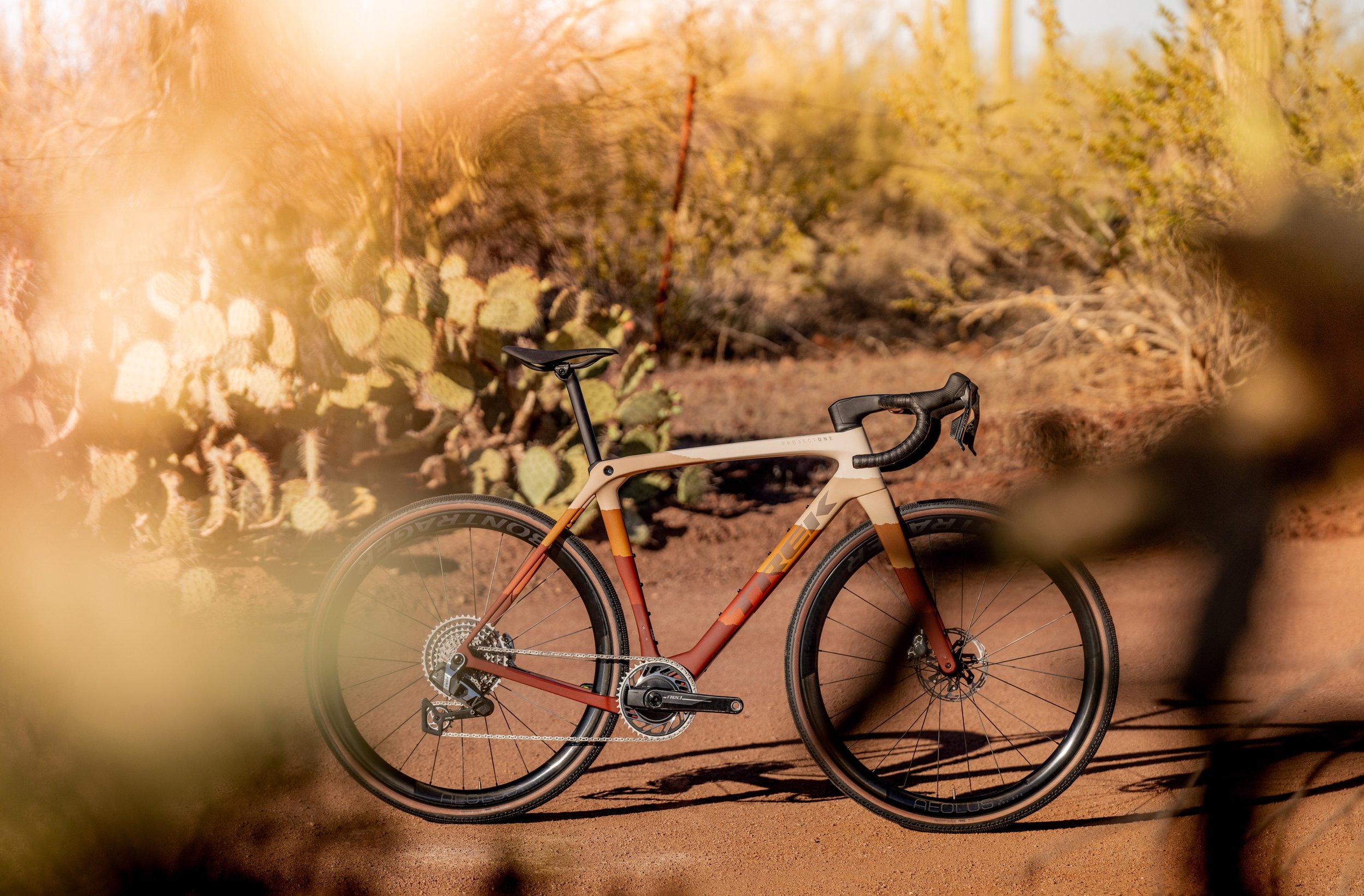
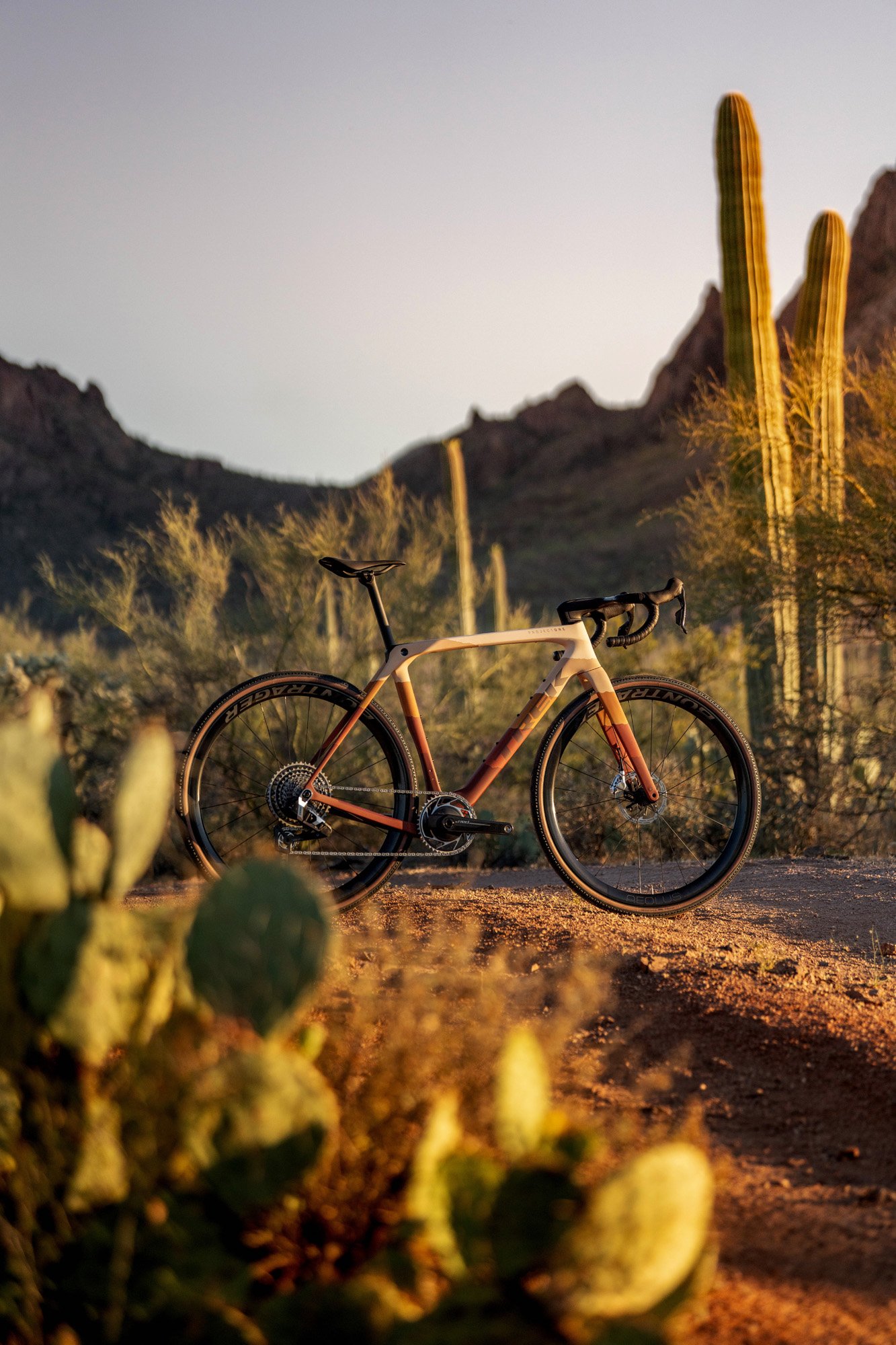


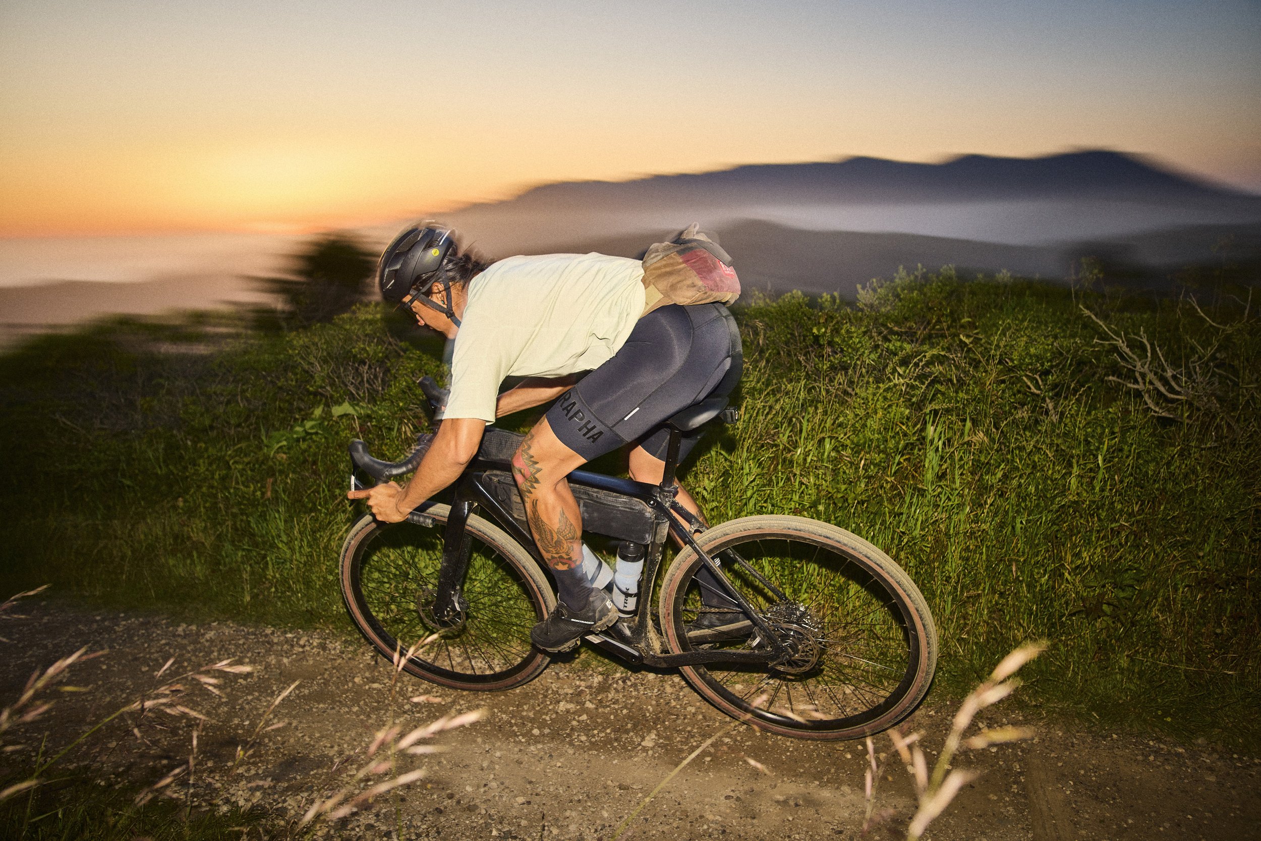

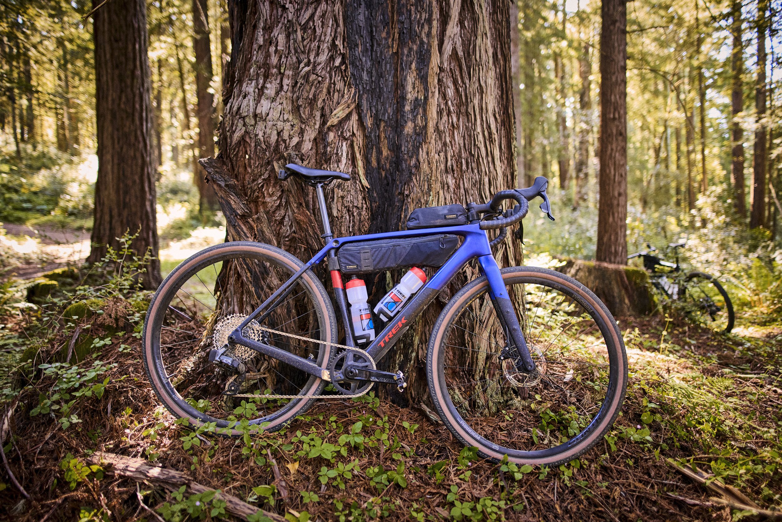
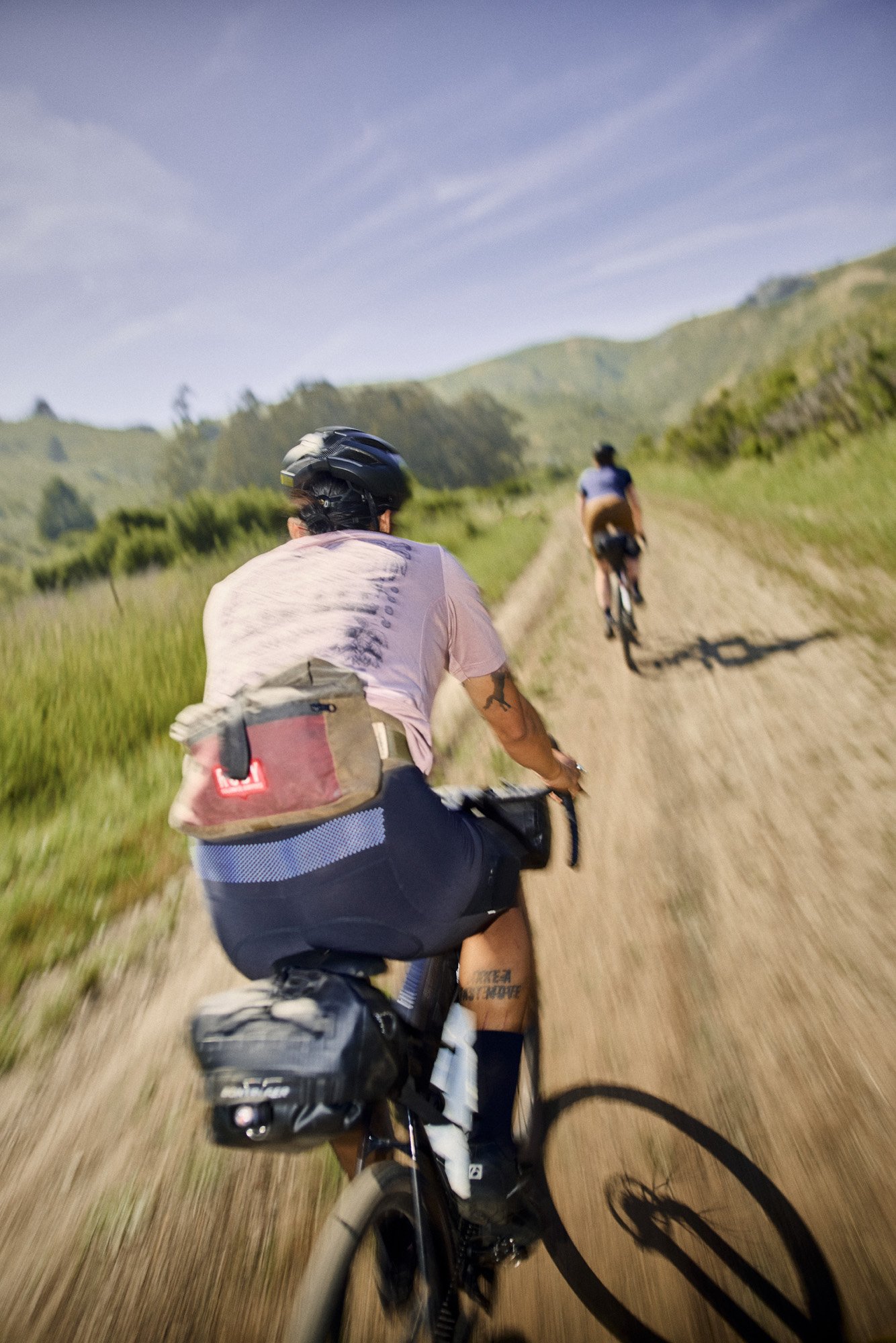


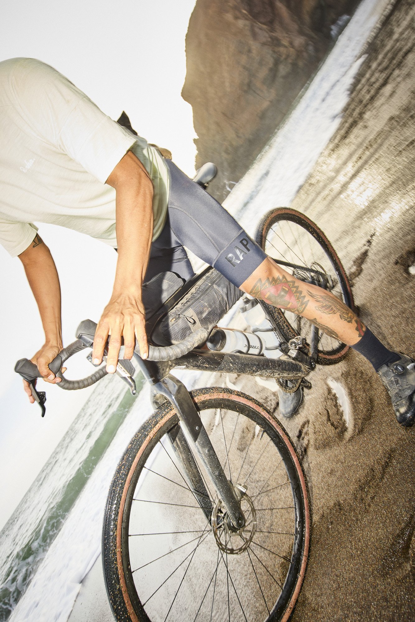
Behind-the-scenes
The journey to a successful product launch
Concept
Rather than approaching the launches as piece-mail, I approached the opportunity with a holistic view. How can we carve out a space for gravel riders within the Trek brand?
Working with the copywriter and product manager, we honed in on the messaging, strategy, and visual direction to support the simultaneous launch of separate, but related bikes.
Pre-Production
I got my hands dirty. In advance of the shoots, I curated outfits for the 2 riders on the Checkpoint shoot (Checkmate used one of pros in his team kit). I aimed to create outfits that were authentic to the riders, and on-trend in the gravel scene.
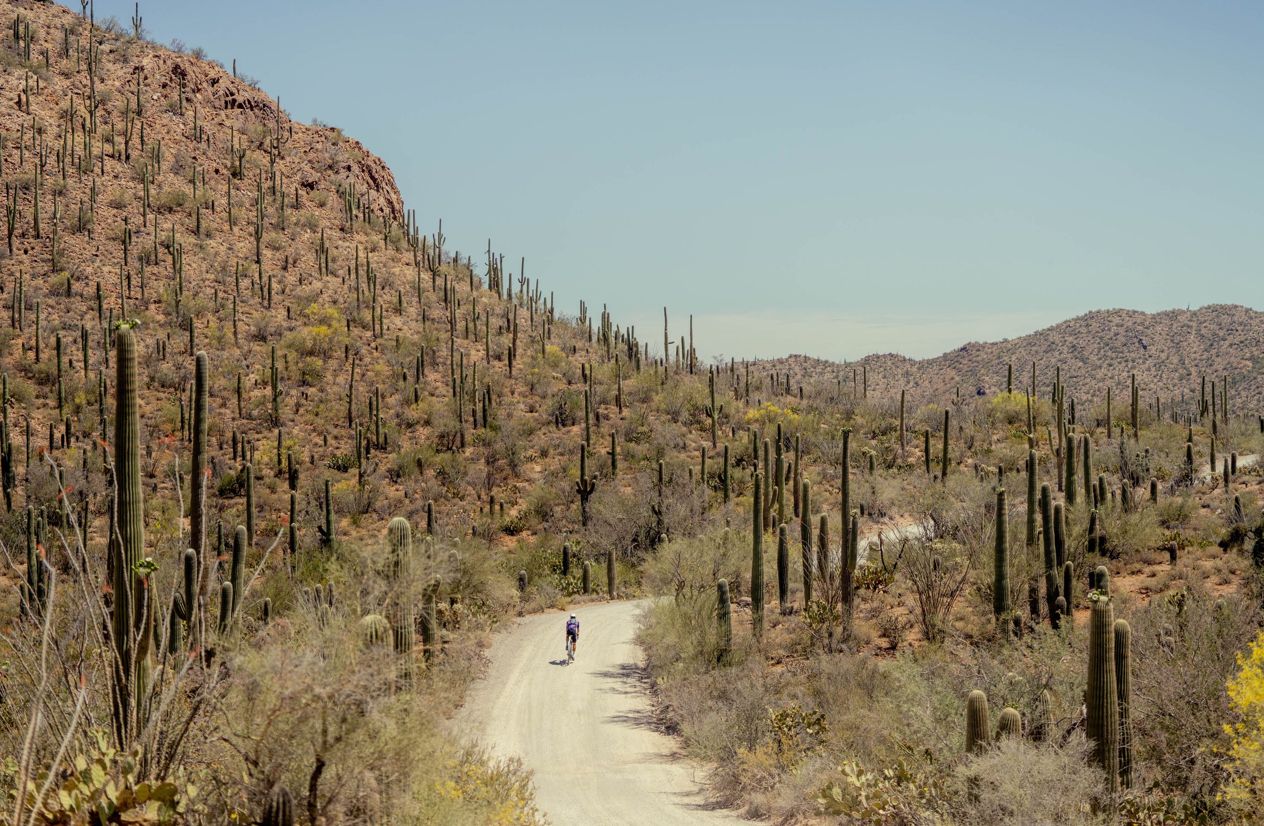
From my couch in Columbus, I scouted locations in Tucson, AZ and the North Bay Area. Using Google Maps, Strava, AllTrails, bikepacking.com, and emailing our pro rider; I provided exact GPS pins and time-of-day suggestions for the teams. In pre-pro meetings, I aligned the teams on shot lists, priorities, and moodboards.

